How Can We Help?
Workflow Form Design
Each Workflow has it’s own form. A form is a collection of different types of fields. You can design your own form with many types of fields available such as text, currency, radio buttons, attachments, etc.
In summary, a form has following information,
- Information holding fields
- Files
- A messages box
- Tasks area (for Arbitrary Workflows only)
- Historical activity
The form flows through the stages of the workflow based on your actions. A form is called a ‘Card’ in WorkHub24 as in the board view (Kanban) a form is represented as a Card.
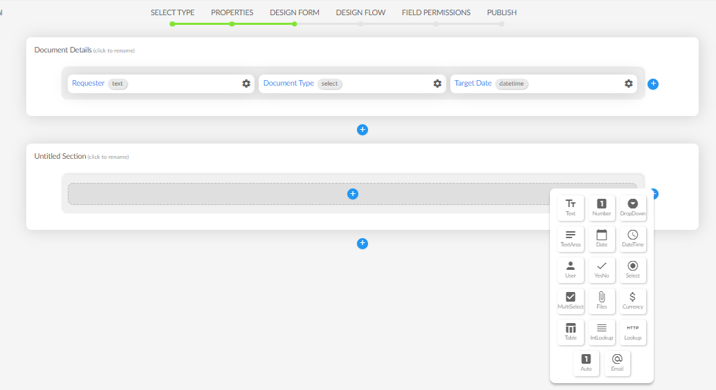
Sections
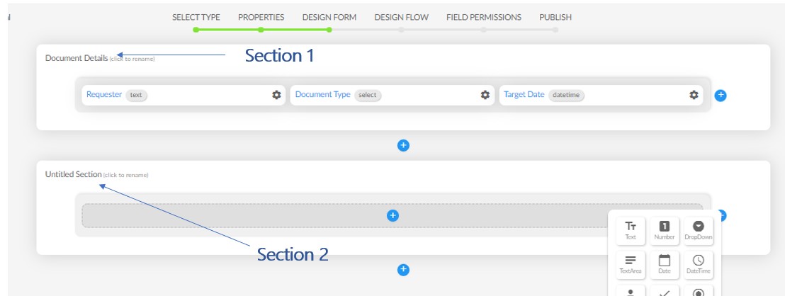
A form can have many sections. A section is a group of related fields organized together. For example, in a Loan Application Form, customer details could be in one section and customer’s income details could be in another section.
you can show/hide a section based on the stage and the user(s).
Fields
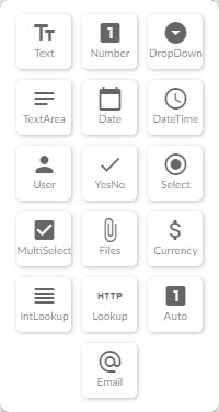
There are more than 15 field types available with WorkHub24 to design your form.
Following are some of the fields available in WorkHub24,
Text – Stores short texts, maximum length is 255 characters
Number – Stores numbers
Dropdown – You can specify a list of values to be selected from
Text Area – A rich text area for user to write lengthy texts
Date – Stores date
Date Time – Stores date and time
User – A field to store a user(s) in your system
Yes/No – Stores Yes or No
Select – A radio buttons option where you can select one of few options
Multi-Select – Multiple check boxes where you can select one or more options by checking
Files – A field that can upload files
Currency – A field to store currency value
Table – This could be either a table you define for the form like a Quotation or a view of an existing Data Table
Internal Lookup (IntLookup) – This field refers to other Data Table column or a different Workflow field. For example, A Vendor field could refer to a Vendor Name field in the Vendors Data Table.
Lookup – This field sends a REST request to a remote server, fetches and shows the value. All the parameters are configurable.
Auto – This field automatically increments the value by one every time a new item is created.
Email – Stores a validated email in this field.
Field Properties
Each field you add to the form has a set of properties, conditions and actions.
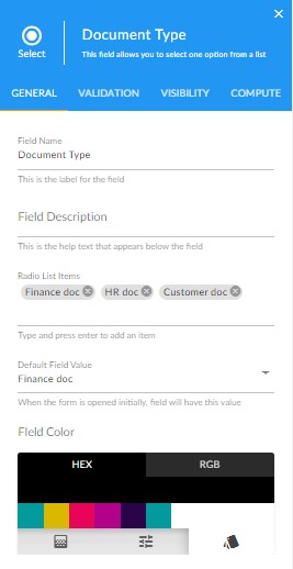
Every field in general has four areas in the properties window.
- General tab: Contains properties such as field name, type, list of values (if it’s a dropdown), field color, etc.
- Validation tab: You can validate the user input based on the settings here. For example, you can validate a ‘Budget’ (Currency field) to always be a value less than 100,000 if ‘Expense Type’ (dropdown field) contains the value ‘Travel’.
- Visibility tab: You can decide the visibility of a field based on your settings here. For example, in a Loan application workflow, if the ‘Profession’ (a dropdown field) is ‘Student’ then ‘Monthly Salary’ (Currency field) is shown and if ‘Profession’ is different, ‘Monthly Salary’ field is then made visible to the user
- Compute tab: Instead of a user entering a value to a field, you can make it read only, do a computation and show the value in this field. You’ll be able to set the value based on visually built equations.